There is plenty of evidence to show that dividend-paying stocks as a whole have lower beta than non-dividend-paying stocks. This is one of the only “free lunches” to be found in investing: lower volatility and higher historical returns. So far, so good, but we need to dive deeper.
Standard deviation
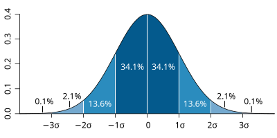
Standard deviation is a statistic that reflects how variable the results within a dataset are relative to the mean of that same dataset. Bitcoin has a huge standard deviation. Fortis (FTS) has a small one. Standard deviations are not compared to a benchmark, rather they are a measure of internal variability.
When measuring the risk-adjusted returns of Beating the TSX stocks, standard deviation is useful in a practical sense because we have access to 30 years of portfolio returns vs only five years of data for beta.
Looking back at the total returns of Beating the TSX portfolios vs the benchmark, we can see that BTSX had higher variability and thus, a higher dispersion of returns.
Interesting. Even though BTSX stocks appear to have lower beta, on average, over the last three decades, portfolio returns have actually been more volatile. BUT, there are two things we must remember that dividend critics often forget:
- Standard deviation doesn’t distinguish between variability that is higher or lower than the mean. Thus, really good years (like 2021) will increase standard deviation and be good for investors – i.e. not all volatility is bad.
- If the portfolio with higher standard deviation has also performed better overall, investors may have been compensated for that variability. This is exactly why we need to understand risk-adjusted returns.
Still with me? Great, because we’re ready for the good stuff.
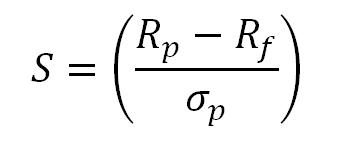
Perhaps you’ve heard of the Sharpe ratio. It measures investment returns against a risk-free rate such as those that investors might receive from treasury or Canada savings bonds. It is calculated by taking the return of the portfolio, subtracting the risk-free rate, and dividing this result by the investment’s standard deviation. The higher the Sharpe ratio, the better.
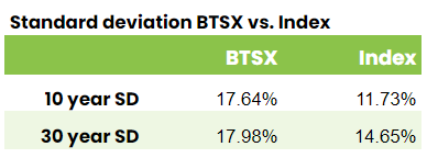
So, using the standard deviation data above and the historical BTSX performance data, we can finally compare the risk-adjusted returns of Beating the TSX vs. the TSX 60 benchmark. Let’s start with a 10-year Sharpe ratio for BTSX:
Rp = 12.29% (BTSX 10 year average total return)
Rf = 1.76% (current 10 year Canada bond rate)
σp = 17.64%
BTSX 10 year Sharpe ratio = 0.597
Now, we can do the same calculation for the index:
Rp = 8.42% (TSX 60 10 year average total return)
Rf = 1.76% (current 10 year Canada bond rate)
σp = 11.73%
Benchmark 10 year Sharpe ratio = 0.568
What we can see from these numbers is that over the last ten years, Beating the TSX investors have enjoyed not just higher returns, but higher risk-adjusted returns. Just for fun, I calculated the 30-year numbers. Here is a summary:
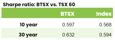
Using the Sharpe ratio, it would appear that Beating the TSX investors have indeed been compensated for any additional volatility they have endured over the last 30 years. But this measurement actually understates the risk-adjusted benefits of Beating the TSX.
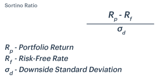
The problem with the Sharpe ratio is that it relies on standard deviation as a measure of risk and standard deviation doesn’t distinguish between variability to the upside or downside. When it comes to investing, it’s really downside volatility that is risky. Enter the Sortino ratio, which only considers downside volatility:
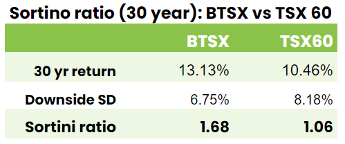
By only considering downside standard deviation, the Sortini ratio doesn’t penalize a portfolio that has displayed outsized positive variability – something all investors hope for. However, because we are only using the variability of down years, we only obtain useful results by using our 30-year data. As you can see, Beating the TSX portfolios now appear even stronger on a risk-adjusted basis:
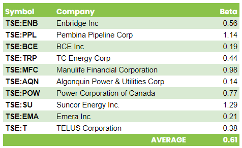
Very interesting data Matt. I tend to measure volatility using beta. It is a relative measure and shows me how volatile a stock is vs. the overall market. Time and again academic studies have shown that stocks with lower beta outperform. Why? I think the reason is that high volatility stocks (e.g., marijuana stocks, NFTs, tech stocks, small caps, etc.) tend to attract speculators not investors and these players make a living from darting in and out of the market, increasing the volatility but decreasing the overall return that we BTSX investors rely upon. Fortunately, stocks with higher dividends usually don’t play a part in speculator’s portfolios. As a general rule I suggest avoiding speculative stocks and sticking with proven investments. Not only will your returns be higher but you will sleep better also.
You are absolutely right, Dave. The fact that low beta stocks have provided better-than-average returns is one of the only “free lunches” in investing and I think your explanation is correct. Once again, even though it can be hard to resist the allure of what’s popular, when it comes to building wealth, boring is better.
Just wondering about the SORTINI Ratio? I see a lot printed about the SORTINO Ratio but not much, if anything about SORTINI. Are these the same thing or just a typo?
Thanks for the article and I agree on the value of knowing what your risk adjusted returns are.
Al
Oops – Apparently I got my vowels mixed up. You’re right – it’s “Sortino ratio”, not Sortini. I have edited the post. Thanks, Al.
Thanks, I enjoy the article. You always make me think about improvements that I can make on my investments. And I always learn something new from your writings.
I know that data for VDY (Vanguard FTSE Canadian High Dividend Yield Index ETF) is only available since 2013, but that may be a better index to compare BTSX with.
I know BTSX are beating VDY since 2013, but it just feel it would be a more apples to apples comparison.
Hi Tom, thanks for the kind words.
I can see why VDY would appear to be a “more apples to apples comparison” with BTSX – no argument there. BUT, it is an ETF, not an index. For a variety of reasons it is standard practice to measure funds and portfolios against a broad index, rather than against other funds. In the case of Beating the TSX, the whole point is to see if our simple method will beat the TSX 60. This is the comparison that we’ve been making for over 30 years. Now, that is not to say that we can’t ALSO compare BTSX to VDY. As you point out, BTSX’s returns are a little better, but there are some investors who would choose the simplicity of an ETF – no problem.
Thanks for the input, though, Tom. Perhaps other readers will weigh in. I wonder if a post comparing BTSX to various high yield funds would be of interest to readers.
Excellent write-up (as usual Matt). Blue-chip dividend growers are less speculative, less volatile. BTSX portfolio is for investors, not traders or speculators. Intuitively it makes sense that it would be less volatile and more profitable for investors.
Thanks for the comment, Sil. Given how efficient markets are, it’s hard to believe (especially for index investors) that there is a method that generates better long-term results with lower risk. Skepticism is a very appropriate reaction to such claims, so it’s important that we take a long hard look at the data. There is more to dig into and I’m looking forward to it.
Man. Thanks again Matt for a fantastic, data-driven post. I think the conclusions you have presented are quite a big deal. For me, even though I’ve always been a huge BTSX fan and it’s been the core of my portfolio for 12 years, I still have, consciously, assumed that an index strategy is “safer.” I’ve been ok with taking added perceived risk by using BTSX because I have a long time horizon and have always accepted a slightly higher risk to gain a higher reward of those beating the index results. But, now it appears those are purely that – perceived, not real – risk. Looking back, I wish I would have used BTSX in my kids’ RESP for the front end of their lives, as I always used broad Canadian and US market ETFs (XIU, XSP primarily) because I just thought they were less risky. Apparently not.
Thanks again
Thanks for the comment, Chad. I had a lot of fun researching and writing this post because I didn’t know what I was going to find. The content was a little technical, but the results are profound.
Pingback: Is dividend investing evidence-based? 5 key findings — DividendStrategy.ca